
Most of us are writers, one way or another. We share our thoughts in blogs and ebooks. And you may have noticed that I have been experimenting recently with emphasizing certain parts of my posts, breaking up longer texts in chapters, and playing around with various formats.
I am doing this to test the so-called F-Shaped pattern of reading. This is a description of how people read online. It was first identified in 2006 by the Nielsen Norman Group. They recently published an update, clarifying that:
- Scanning on the web does not always take the shape of an F. There are other common scanning patterns too.
- The F-pattern can be bad for users and businesses.
- Good design can prevent F-shape scanning.
Let’s examine all this in detail, shall we?
What Is The F-Shaped Pattern?
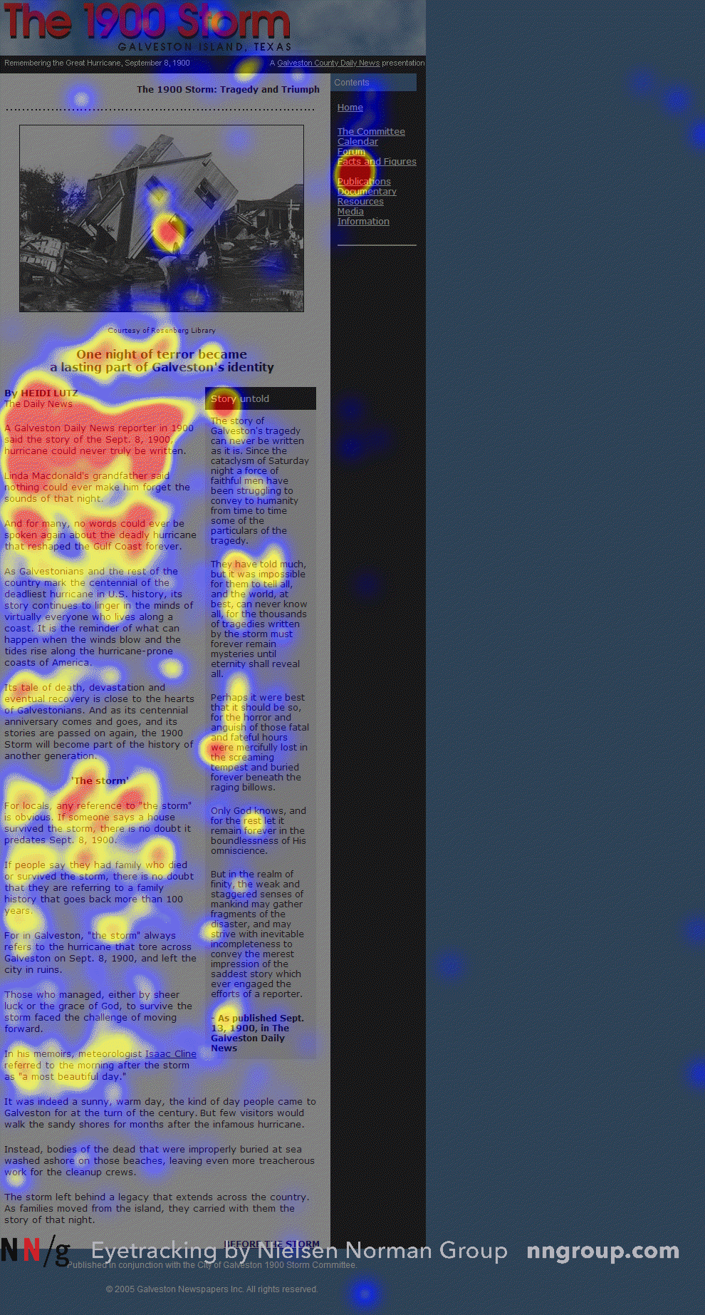
Image: Nielsen Normal Group
As you can see for the heatmap above, people’s eyes focus on certain parts of the page when reading. Specifically:
- Users concentrate at the top and the left side of the page.
- They first read in a horizontal movement, usually across the upper part of the content area. This initial element forms the F’s top bar.
- Next, users move down the page a bit and then read across in a second horizontal movement that typically covers a shorter area than the previous movement. This additional element forms the F’s lower bar.
- Finally, users scan the content’s left side in a vertical movement. Sometimes this is a slow and systematic scan that appears as a solid stripe on an eyetracking heatmap. Other times users move faster, creating a spottier heatmap. This last element forms the F’s stem.
There are two main implications of this pattern:
First lines of text on a page receive more gazes than subsequent lines of text on the same page.
and
First few words on the left of each line of text receive more fixations than subsequent words on the same line.
It should be noted that this pattern applies to users’ reading of the content area of the web page. If there is a sidebar at the left, for example, their eyes will skip that and start reading where the content itself is.
Interestingly, in right-to-left languages such as Arabic, people read in a flipped F-shaped pattern (from right to left).
The F-Shaped Pattern Is Not the Only Scanning Pattern
In th ier recent update, the NN Group explains their latest findings. First of all, in addition to the F-shaped pattern, there are many other possible scanning patterns, including those listed below:
- Layer-cake pattern occurs when the eyes scan headings and subheadings and skip the normal text below. A gaze plot or heat map of this behavior will show horizontal lines, reminiscent of a cake with alternating layers of cake and frosting.
- Spotted pattern consists of skipping big chunks of text and scanning as if looking for something specific, such as a link, digits, a particular word or a set of words with a distinctive shape (such as an address or signature).
- Marking pattern involves keeping the eyes focused in one place as the mouse scrolls or finger swipes the page, like a dancer fixates on an object to keep balance as she twirls. Marking happens more on mobile than on desktop.
- Bypassing pattern occurs when people deliberately skip the first words of the line when multiple lines of text in a list start all with the same word(s).
- Commitment pattern consists of fixating on almost everything on the page. If people are highly motivated and interested in content, they will read all the text in a paragraph or even an entire page. (Don’t count on this to happen frequently, though. Assume that most users will be scanning.)
Why People Scan in an F-Shaped Pattern
People scan in an F-shape when all of these 3 elements are present:
- A page or a section of a page includes text that has little or no formatting for the web. For example, it has a “wall of text” but no bolding, bullets, or subheadings.
- The user is trying to be most efficient on that page.
- The user is not so committed or interested that they are willing to read every word.
The last two elements pretty much summarize all web behavior: the vast majority of the web users would rather finish their tasks as fast as possible with the minimum amount of effort. They visit a page because they want to find a quick answer rather than read a dissertation on the topic and educate themselves.
Why Is The F-Shape Bad for Users and Businesses?
When people scan in an F-shape, they miss big chunks of content based merely on how text flows in a column. The skipped phrases and words are often as important — or even more important — as those words that are read. But users won’t realize this, since by definition they don’t know what they don’t see.
The F-shaped scanning pattern means that users may skip important content simply because it appears on the right side of the page.
What Are The Best Antidotes To The F-Shaped Pattern?
When writers and designers have not taken any steps to direct the user to the most relevant, interesting, or helpful information, users will then find their own path.
In the absence of any signals to guide the eye, they will choose the path of minimum effort and will spend most of their fixations close to where they start reading (which is usually the top left most word on a page of text). If your pages have big chunks of unformatted text, people will scan it in an F-shape.
Good web formatting, however, reduces the impact of F-scanning.
Specifically, you need to prioritize and format text to direct users to what you want them to see. Some simple tips:
- Include the most important points in the first two paragraphs on the page.
- Use headings and subheadings. Ensure they look more important, and are more visible, than normal text so users may distinguish them quickly.
- Start headings and subheadings with the words carrying most information: if users see only the first 2 words, they should still get the gist of the following section.
- Visually group small amounts of related content — for instance, by surrounding them with a border or using a different background.
- Bold important words and phrases.
- Take advantage of the different formatting of links, and ensure that links include information-bearing words (instead of generic “go”, “click here” or “more”). This technique also improves accessibility for users who hear links read aloud instead of scanning the content visually.
- Use bullets and numbers to call out items in a list or process.
- Cut unnecessary content.
In this article, you will notice that I have boldened certain words and lines. This is a common trick and works well to guide your eye to the most iportant content.
Keep in mind however, that in responsive design, text flows differently depending on window size. So, a user who scans in an F-shape on his phone, for example, would not fixate on the same words if he F-scanned the same page on a desktop— just because of the way the content flows in different viewport sizes.
So, while it’s hard to control people’s motivation or their goals, you can still optimize content and presentation to help users find what they need quickly.
In particular, use good web-formatting techniques to draw attention to the most important information instead of relying on the arbitrary words that people may fixate on when they scan in an F-shape.
You can read the full post, along with more great articles, on Nielsen Norman’s website.

Reblogged this on Kim's Musings.
LikeLiked by 1 person
Reblogged this on Chris The Story Reading Ape's Blog.
LikeLiked by 1 person
Thanks for this, Nicholas.
Though now you have me reading pages to see how I am ‘scanning’ them! 🙂
Best wishes, Pete.
LikeLiked by 1 person
Lol–you’re welcome 😀
LikeLiked by 1 person
Reblogged this on Legends of Windemere.
LikeLiked by 1 person
This is a fascinating post, Nicholas. Since reading it I’ve realised I do exactly that. (Although I did read all of this post!)
My own posts need looking at carefully in future, but it is a problem when people read on so many different devices.
LikeLiked by 1 person
Exactly. Responsive design solved a lot of problems… but created others!
LikeLike
Another great information, Ncholas! Thank you very much. Could be very useful for making print magazines too. Best wishes, Michael
LikeLiked by 1 person
That’s true! I doubt people read much differently on paper.
LikeLiked by 1 person
Thank you very much, Nicholas. Till you posting i never had thoughts about, but its true. Have a beautiful weekend! Michael
LikeLiked by 1 person
I wonder how exactly they came up with the “F” answer. Was there a study performed? (I admit, I did not click on your hyperlinks.) As you say later in the post, that method is not the only method of reading. It varies, depending on the reader and the writer/ person who formats the page. My conclusion is that people’s attention’s span is almost non-existent, that people have little time to do anything and that people do not like reading all that much anymore (at least anything longer that a Tweet). Does that mean that reading/ writing is doomed?
LikeLiked by 1 person
Yes, they ran a study over a decade ago and recently updated it. As for your conclusion, I agree–in part. People do have less free time but I don’t think it’s a case of them not reading any more. You may wish to check out my post on the subject for some interesting data on the subject: https://nicholasrossis.me/2017/07/01/market-your-book-for-the-right-age/
LikeLiked by 1 person
Reblogged this on deborahjay.
LikeLiked by 1 person
Interesting post, Nicholas, thanks. I was trained as a designer originally (3D rather than 2D, but many of the disciplines are the same) and how people scan to read should certainly be a major consideration in web design. Cheers, Jon.
LikeLiked by 1 person
Absolutely, Jon! Thanks and enjoy the weekend 🙂
LikeLiked by 1 person
You have a good one too, Nicholas 🙂
LikeLiked by 1 person
Sometimes the English language makes me chuckle. Like, when I say, “enjoy the weekend.” Since it’s actually in the Imperative, I always imagine an “…or else” in the end 😀
LikeLike
Reblogged this on Wilfred Books and commented:
Do you read the F in websites?
LikeLiked by 1 person
Reblogged this on Author Don Massenzio and commented:
Check out this interesting post from Nicholas Rossis blog with the topic: How Do People Read Online?
LikeLiked by 1 person
Reblogged this on Loleta Abi Author & Book Blogger and commented:
This could prove useful! Knowing what draws a reader’s attention to the page strengthens our ability to give them what they need.
LikeLiked by 1 person
Hmm… Most interesting, Nicholas. One has to wonder who does these studies? 🙂
LikeLiked by 1 person
In this case, it was the Nielsen Normal Group. Advertisers are very keen on performing studies like this, as you can imagine 🙂
LikeLiked by 1 person
I normally taught my college students that zig zag reading makes most sense. I never really distinguished with the online “F”format you talked about. Thanks for the education.
LikeLiked by 1 person
Glad you found it useful! A link to direct your students to, I hope 🙂
LikeLiked by 1 person